So you wanna make a monster tamer?
I love pokemon. I'm not entirely sure why I love the genre, but there's something special about power being defined by your magical monster friends, and raising them to become absolute powerhouses. It's also an even field, where you (usually) have access to everything that your opponents throw at you.
There's just something really impactful about someone sending out this powerful monster you haven't seen yet, then you wind up finding them in the wild and adding them to your team. Or even if you do know what the monster is, and also know just how good it is, and now you have to face it.
Something I've always wanted to do was make a game like it--with my own monster ideas and mechanics--while sticking to the things I actually enjoy about the series. So that's what I'm going to do. Or try to.
So, I sat down today and threw together a quick battle scene in unity. I figured that since the battle is the most important part that everything else is built on, it'd probably be a good idea to get this functional before everything else. That and I wanted to practice UI some more.
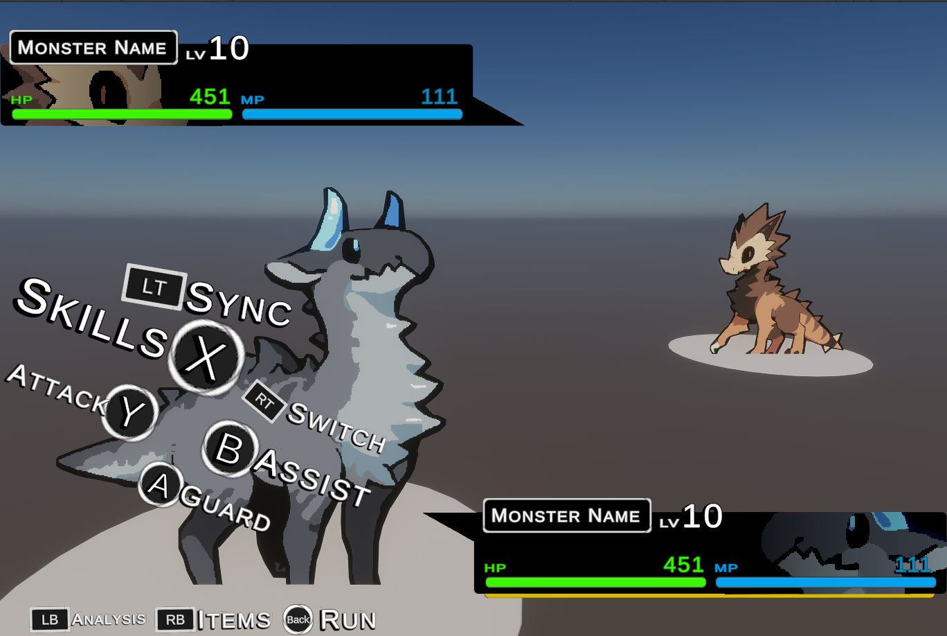
All of the UI sprites are default Unity ones, save for the little triangle arrows and that fade on the faces. I was aiming for something more stylish than a typical pokemon game, which if you need a refresher:
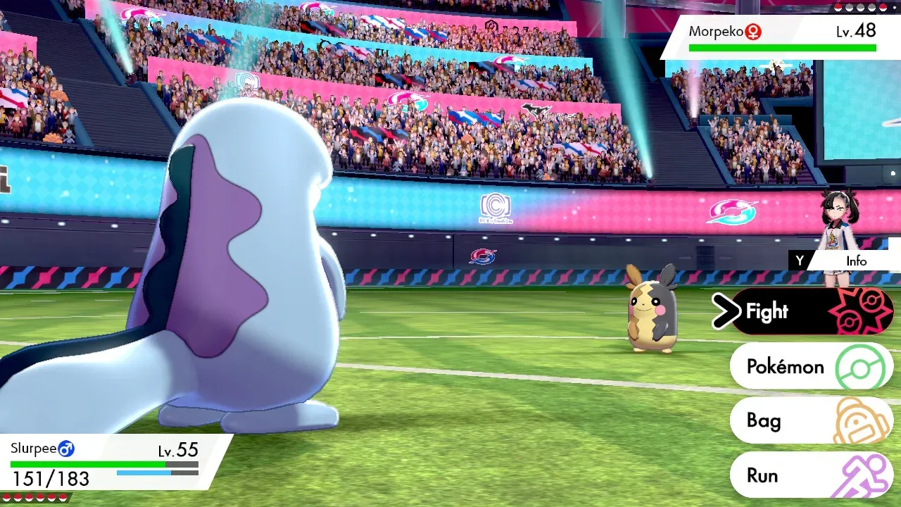
It's not bad, just very clean, maybe sterile. It's surprisingly plain for a game that was so heavily focused on the "sport" aspect of pokemon battling.
When it comes to ux flow and ui style that both conveys the importance of the options on top of just looking cool, Atlas is absolutely on another level. For this first pass of the UI in this little project, I specifically took a lot of inspiration for Metaphor: ReFantazio.
UI itself follows the idea that people observe things in a "Z" shape starting from the top-left, but it's more of a lazy Z than anything. This is due to the eye actually prioritizing the center after the first focus point, which is because it's a shorter path than going all the way to the top-right.
As a result, that part of the screen tends to be peripheral and not really all that focused on.
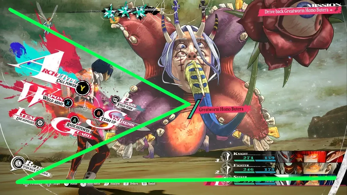
And as you can see, Metaphor's UI actually follows the flow of this lazy Z very well. How does my UI fare? Well...
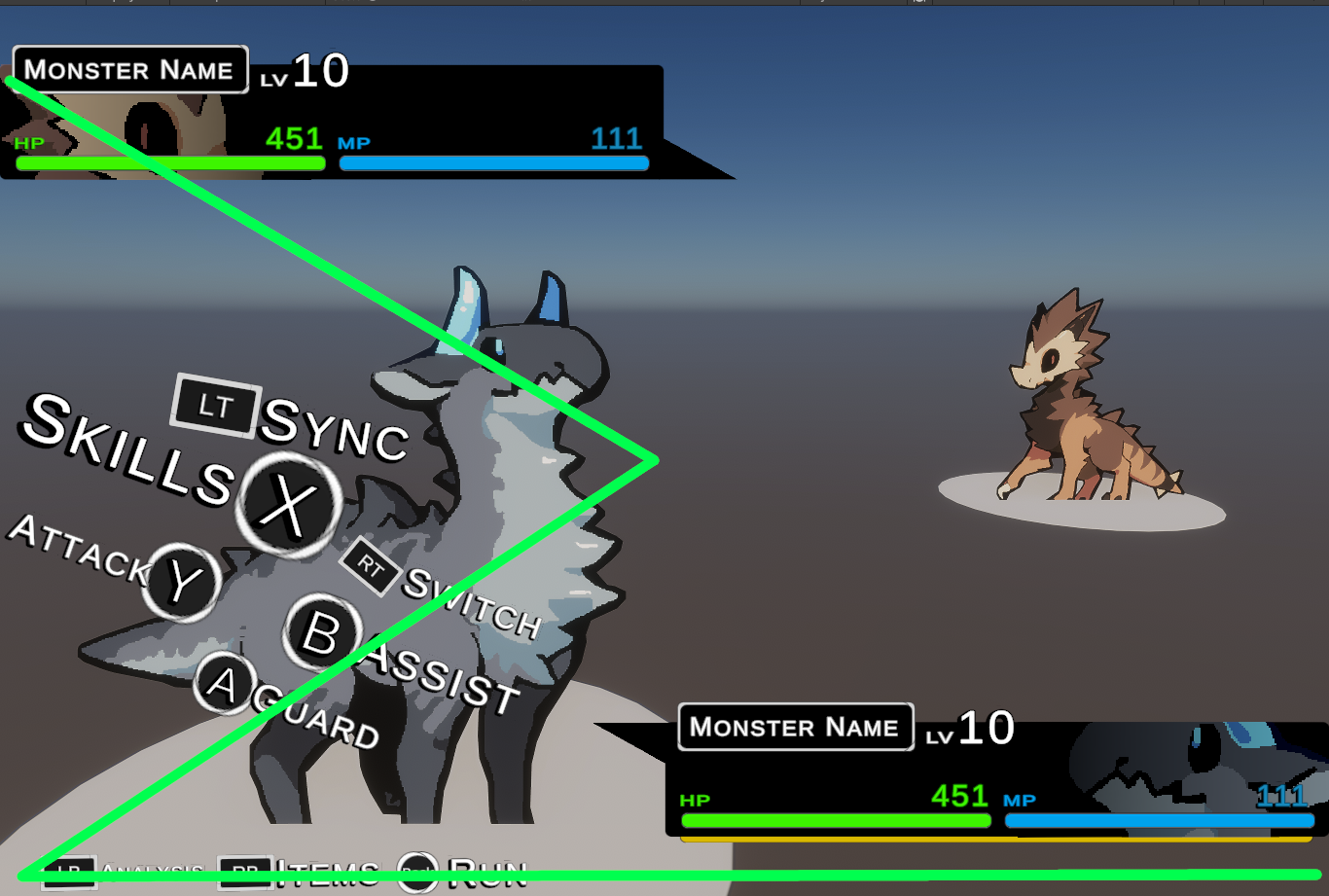
While the Switch, Assist, and Guard buttons are pretty close, the Sync, Skill, and Attack (sync especially) don't quite have the same kind of flow, and aren't quite as easy on the eyes. So the second iteration will need to tune that up a bit. Really, I think it's the sync button that really throws you off, and really that thing should be more accented to show that it's important, since it's this game's version of capturing.
You could also say that there's too many words that have too common of letters. Too many S's, too many A's. The repetition can "soften" the impact, making it easier to just glance past what was actually very important.
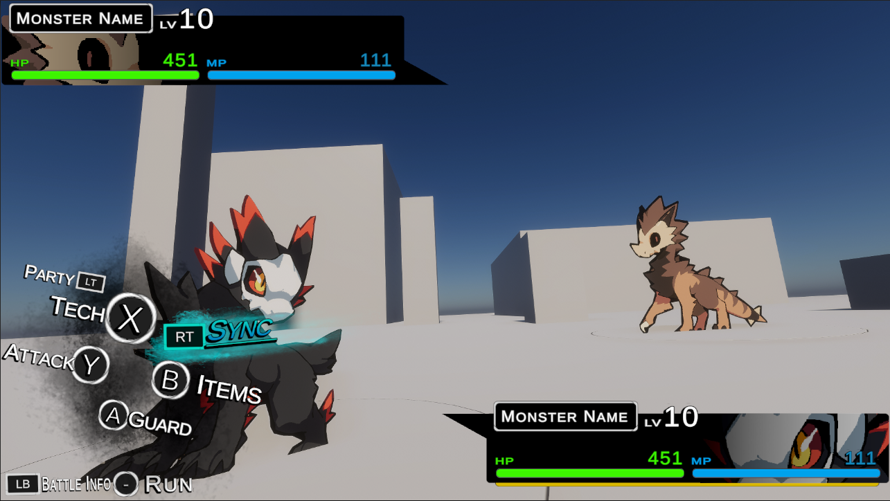
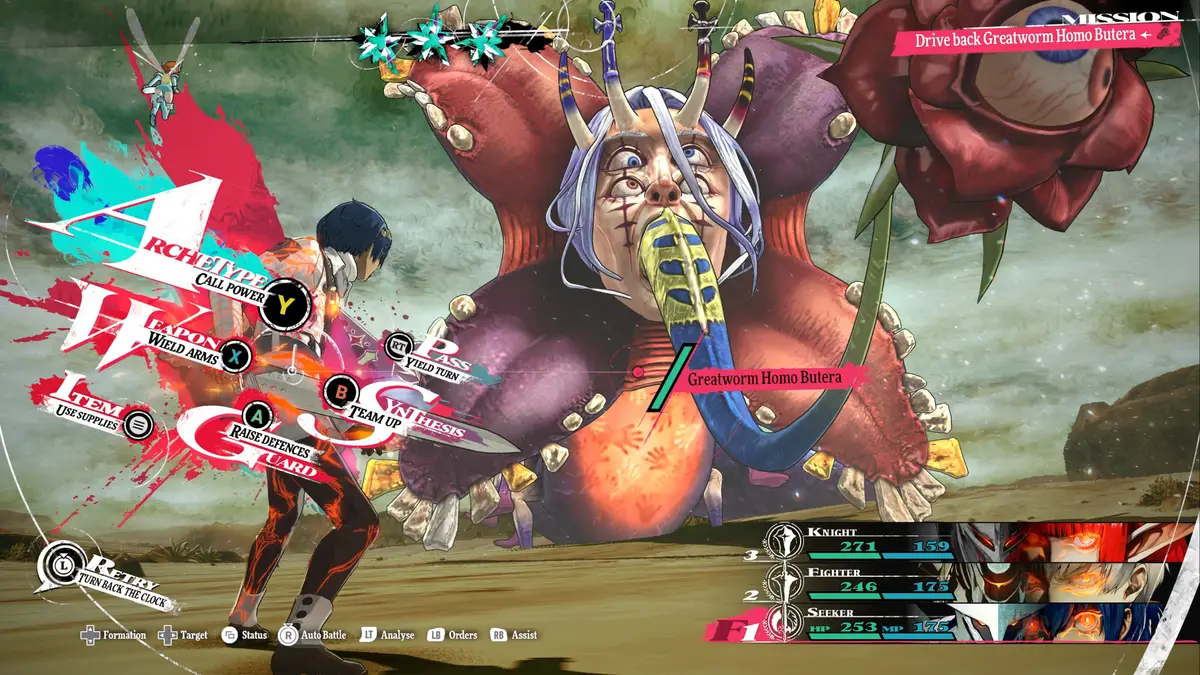
So let's dive into this one. First I created some very simple grunge textures to put more emphasis on the buttons. I also moved Sync over to Right Trigger, because it made more sense if the opposing monster is on the right. I also aimed Sync towards the enemy and crossing over the monster, really just emphasizing the importance of this mechanic as well as how it's related to your little critters.
Originally, each button was slightly rotated differently, but for readability I decided to make them the same. The buttons were shrunk down and set to better align with the eye, while not covering your monster as much.
The words were all changed as well to make the reading "bumpier". You can go back and compare the two to see what I mean, but basically almost every option is given its own importance. This helps your eye not gloss over things. The only one that isn't easy to notice is "party" and I might wind up switching around Party and Items.
You might notice "Assist" is gone completely. The idea behind Assist is that a monster will be able to perform a skill while another one is still out, so I figured that it'd be fine to simply let you access it through the party menu. One less menu to have to sift through.
I wound up pulling the camera back, which made the opponent's monster a little too small. So, I scaled them up by 1.7x.
The camera iself was also slanted to make it more dynamic, as well as pulled up and pushed down a little. If you compare the two, I feel like this one is a lot more eye-catching.
After all this, I angled the player's monster to look more like it's facing the enemy, further helping keep things from looking too flat. I don't really mind the look, but there is a part of me that wonders if back sprites would actually look better.
Regardless. Next time, things are about to get much, much more technical. It's time to dive into data and make these beasties and UI actually functional.
This is part 1 of a series! You can read part 2 here: link
Member discussion